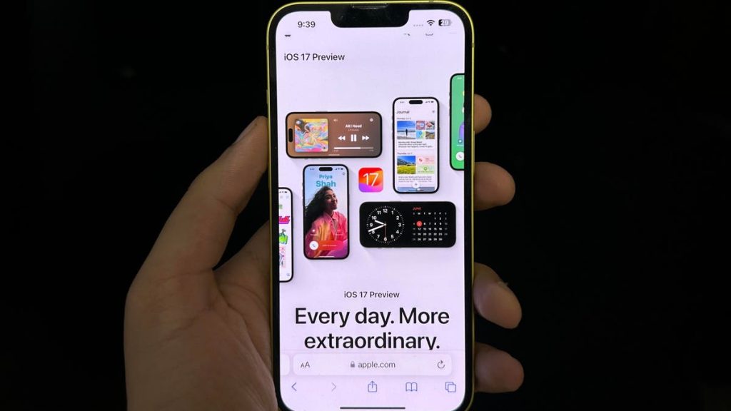
This week, 10 years ago, Apple announced iOS 7 – the last major visual revamp to the user interface (UI). It dropped the skeuomorphism in favor of a more minimalist approach. Since then, the company has relied on offering updates and adding features to its system apps for new iOS announcements. Apart from the Control Center overhaul with iOS 11 in 2017, I can’t think of an instance where Apple changed its UI design with a major OS release.
There were rumors that iOS 17 would be a major update with a focus on design – and I blame it for my disappointment. I was expecting some major changes to the UI and design with the 2023 iOS update. But to my dismay, Apple thinks a 2013 design language works flawlessly in 2023. I’ve been using the iOS 17 beta for six days now and haven’t seen any hero feature that encapsulates the update.
Sure, making custom stickers, offering check-ins, journaling in a new app, and creating big photos for the caller ID are nice-to-haves, but there is no hero feature. The notifications are still a mess; there is no room for customization apart from adding widgets, and multitasking is still a far-fetched dream. But the bigger issue, in my opinion, is the fact that a 10-year-old design language is still a part of my much-beloved iPhone in 2023.
It’s 2023, please let me place an app wherever I want, Apple. Reachability is an issue for the Pro Max iPhones. For instance, I have four app screens right now, and on the last screen, there are just four apps. It’s a tedious task to reach them because the OS doesn’t allow me to place them at the bottom.
It’s just an example – of course, I use Search to get to my apps, but that’s because I can’t have my favorite apps where I want them to be. To make them reachable on the primary home screen, I have to use widgets, and on the second screen, I rely on filling the screen with less-used apps at the top so I have better reachability on my often-used apps.
The system icons look the same as in 2013. There haven’t been any visual changes to the icons in a long time. On the other hand, Android has Material You – icons change colors based on the wallpaper, which makes the UI look more immersive. I don’t want so many green icons on top of my purple background – it looks awful.
I have no choice but to deal with it. Customization hasn’t been a priority on iOS ever, but I’m talking about giving the system a more coherent look and feel. It adds to the nuance. Year after year, Google is adding things to its Material You implementation on Android, while iOS seems to be taking a safe approach.
Then comes the way iOS handles notifications – it’s terrible. As of now, the system acts on a per-app basis. You can choose if notifications appear on the lock screen, Notification Center, or banner, or all of them. iOS also lets you choose the way they are displayed – persistent or temporary banner.
But when you get a slew of notifications from different apps, they pile up in the Notification Center and become a big mess. And it’s been this way for years. For the unaware, notifications are grouped by app in chronological order in the Notification Center. If you have multiple notifications from one app, all of them are stacked behind the behind the latest one.
For instance, if you’ve got multiple messages on WhatsApp since morning, and you are checking your phone in the evening, you’ll see only the latest message. If you want to see the rest of the notifications from WhatsApp, you need to tap on the stack and you are greeted by all the messages in the form of notification banners, which can become a big scrolling list of banners. It’s overwhelming. By contrast, Android takes a much cleaner approach by displaying all the messages in one single notification that can be expanded by holding and swiping down.
In the past few years, we’ve had iOS 16 with lockscreen customizations for better visuals and iOS 14 with App Library and the ability to include widgets to the homescreen but it was only with iOS 7 in 2013 that we saw a visual revamp of the UI. I believe 10 years is a long time, and it’s high time we get a more immersive and better looking interface on the iPhones. It didn’t happen with iOS 17 but there’s always next year.
Read the full article here


