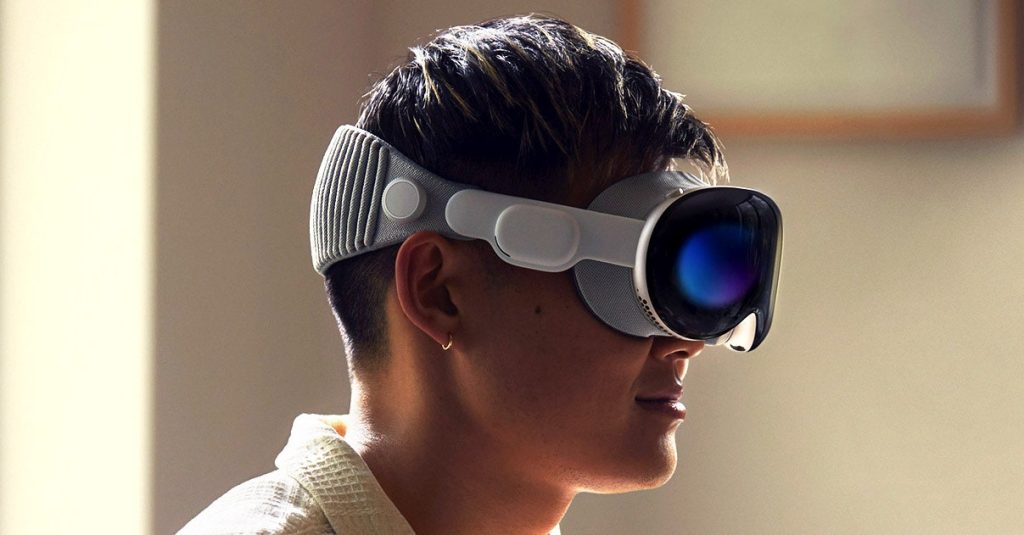
Like everyone else who got to test Apple’s new Vision Pro after its unveiling at the Worldwide Developers Conference in Cupertino, California, this week, I couldn’t wait to experience it. But when an Apple technician at the ad hoc test facility used an optical device to check out my prescription lenses, I knew that there might be a problem. The lenses in my spectacles have prisms to address a condition that otherwise gives me double vision. Apple has a set of preground Zeiss lenses to handle most of us who wore glasses, but none could address my problem. (Since the Vision Pro is a year or so away from launch, I wouldn’t have expected them to handle all prescriptions in this beta version; even after years of operation, Warby Parker still can’t grind my lenses.) In any case, my fears were justified: When I got to the demo room, the setup for eye-tracking—a critical function of the device—didn’t work. I was able to experience only a subset of the demos.
What I did see was enough to convince me that this is the world’s most advanced consumer AR/VR device, and I was dazzled by the fidelity of both the virtual objects and icons floating in the artificially rendered room I was sitting in, and the alternate realities delivered in immersion mode, including sports events that put me at the sidelines, a 3D mindfulness dome that enveloped me in comforting petal shapes, and a stomach-churning excursion to a mountaintop that equalled the best VR I’d ever sampled. (You can read Lauren Goode’s description of the full demo.)
Unfortunately, my eye-tracking issue meant I didn’t get to sample what might be the most significant part of the Vision Pro: Apple’s latest leap in computer interface. Without a mouse, a keyboard, or a touch-sensitive display screen, the Vision Pro lets you navigate simply by looking at the images beamed to two high-resolution micro-OLED displays and making finger gestures like tapping to choose menu items, scroll, and manipulate artificial objects. (The only other controls are a knob called a digital crown and a power button.) Apple describes this as “spatial computing,” but you could also call it naked computing. Or maybe that appellation has to wait until the approximately 1-pound scuba-style facemask is swapped out in a future version for supercharged eyeglasses. Those who did test it said they could master the tools almost instantly and found themselves easily calling up documents, surfing through Safari, and grabbing photos.
VisionOS, as its called, is a significant step in a half-century journey away from computing’s original prison of an interface: the awkward and inflexible command line, where nothing happened until you invoked a stream of alphanumeric characters with your keyboard, and everything that happened after that was an equally constricting keyboard workaround. Beginning in the 1960s, researchers led an assault on that command line, starting with Stanford Research Institute’s Doug Engelbart, whose networked “augmenting computing” system introduced an external device called the mouse to move the cursor around and select options via menu choices. Later, scientists at Xerox PARC adapted some of those ideas to create what was to be called the graphical user interface (GUI). PARC’s most famous innovator, Alan Kay, drew up plans for an ideal computer he called the Dynabook, which was sort of a holy grail of portable, intuitive computing. After viewing PARC’s innovations in a 1979 lab visit, Apple engineers brought the GUI to the mass market, first with the Lisa computer and then the Macintosh. More recently, Apple provided a paradigm with the iPhone’s multi-touch interface; those pinches and swipes were intuitive ways of accessing the digital faculties of the tiny but powerful phones and watches we carried in our pockets and on our wrists.
The mission of each of those computing shifts was to lower the barrier for interacting with the powerful digital world, making it less awkward to take advantage of what computers had to offer. This came at a cost. Besides being intuitive by design, the natural gestures we use when we’re not computing are free. But it’s expensive to make the computer as easy to navigate and as vivid as the natural world. It required a lot more computation when we moved from the command line to bit-mapped displays that could represent alphanumeric characters in different fonts and let us drag documents that slid into file folders. The more the computer mimicked the physical world and accepted the gestures we used to navigate actual reality, the more work and innovation was required.
Vision Pro takes that to an extreme. That’s why it costs $3,500, at least in this first iteration. (There’s an argument to be made that the Vision Pro is a 2023 version of Apple’s 1983 Lisa, a $10,000-plus computer which first brought bit-mapping and the graphical interface to a consumer device—and then got out of the way for the Macintosh, which was 75 percent cheaper and also much cooler.) Inside that facemask, Apple has crammed one of its most powerful microprocessors; another piece of custom silicon specifically designed for the device; a 4K-plus display for each eye; 12 cameras, including a lidar scanner; an array of sensors for head- and eye-tracking, 3D mapping, and previewing hand gestures; dual-driver audio pods; exotic textiles for the headband; and a special seal to prevent reality’s light from seeping in.
Read the full article here


